The United Nations World Food Programme
ShareTheMeal
Role
Product designer
Platform
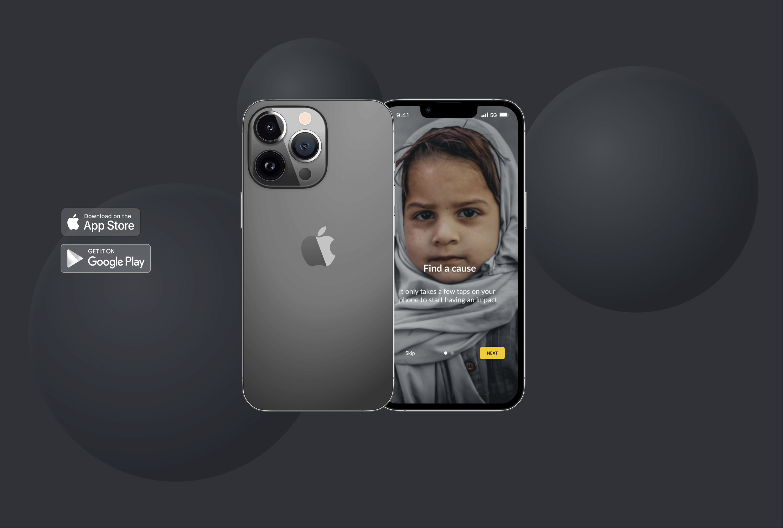
iOS mobile app
Year
2022
Problem
ShareTheMeal is a charity application designed to help provide meals for children. Helping children and families access food from across the globe. Those who wish to donate to charity face fears of an organization's legitimacy. The charity, ShareTheMeal falls into this classification. With the ambition to fight world hunger, ShareTheMeal aims to share meals with children for donations of as little as CAD $1.10. They were founded and recognized under The United Nations World Food Programme in 2015. However, many are unaware of their affiliation and are hesitant to donate.
Solution
Develop a way for users to understand the organization, ShareTheMeal, their mission, and what they set out to do. Providing this information upfront gives individuals trust and reassurance when donating.
Quantitative research
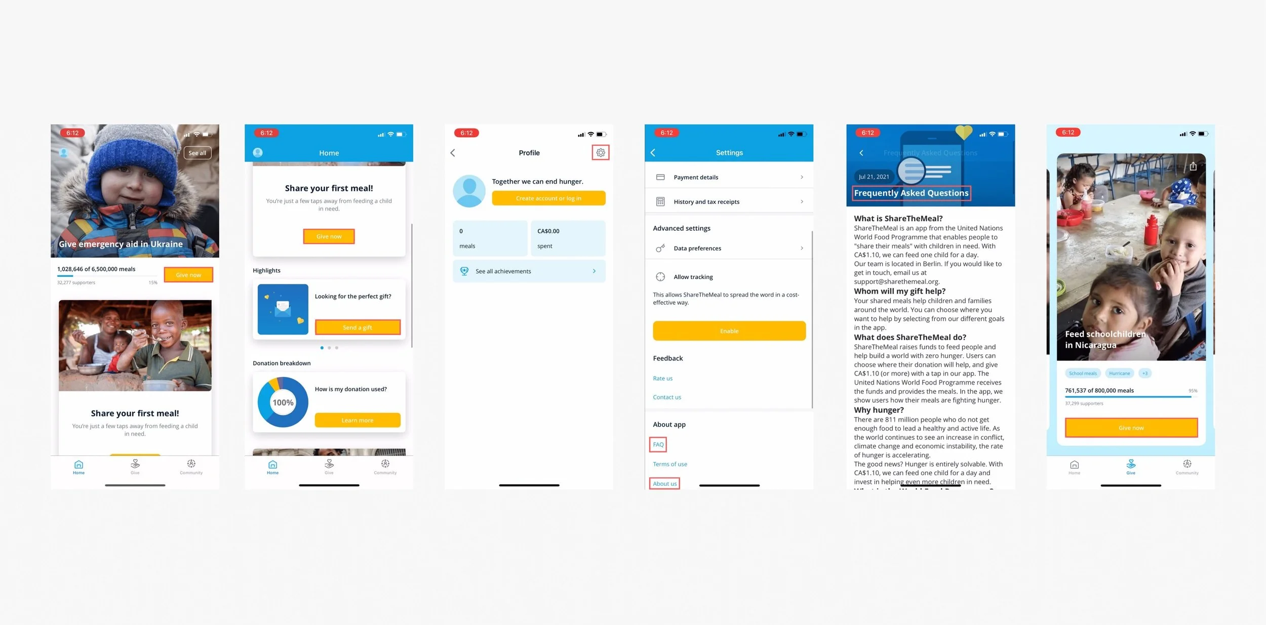
Upon entry into the app, users are faced with an immediate “Give Now” prompt. This button provides hesitancy for users as they cannot understand who they are giving. Further down the homepage, there are “Give now” and “Send a gift” donation prompts. There is no clear explanation of how for CAD $1.10, one can provide a meal for a child.
There is no mission statement found on the homepage of the app. The About us and FAQs are hidden in tertiary categories under the profile page. 30% of users were successful in locating this information about the charity.
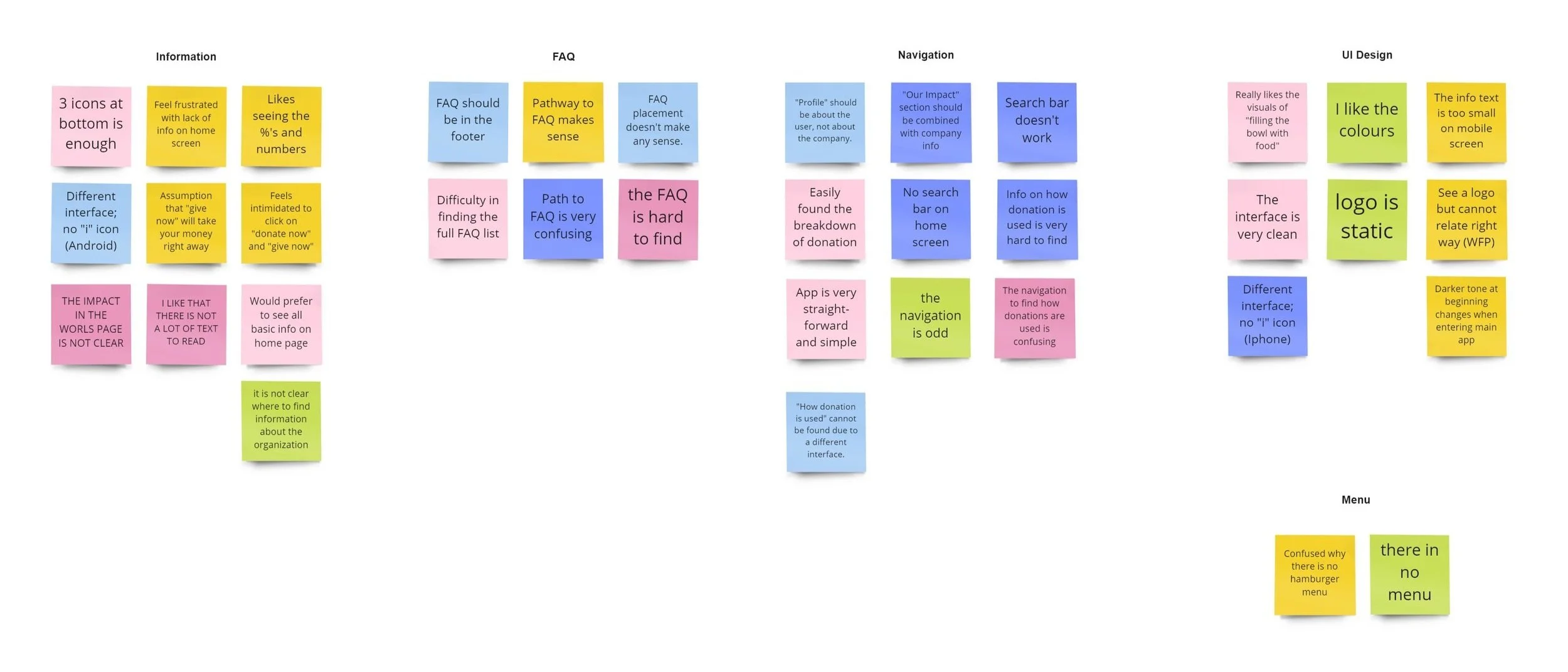
Affinity diagram
To improve the current iOS app, I ran 5 user interview tests. The feedback justified most of the issues I had previously noticed while using the app. The issues identified were the homepage did not share information about the organization, the charity's mission was uneasy to locate, the FAQs were hidden, and managing donations was unclear.
These problem areas motivated which areas to focus on in the redesign- Information, FAQ, Navigation, UI design, and Menu.
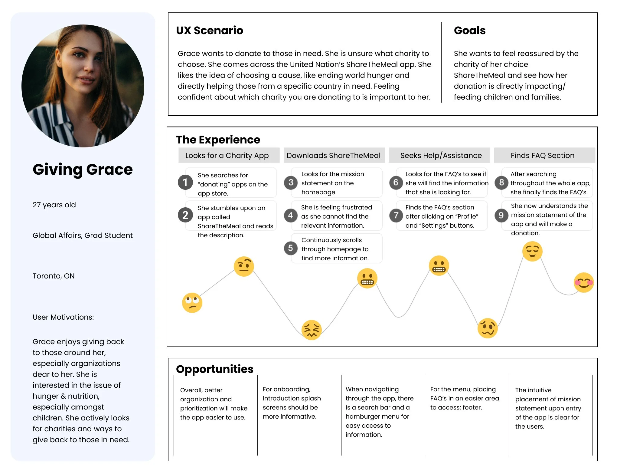
The persona
To better understand users and their needs, a user persona was created. Giving Grace is a 27 year old graduate student pursuing her Master’s in Global Affairs. She is passionate about helping fight world hunger. When making in-app donations with ShareTheMeal she finds it difficult to understand where her money is going. She is hesitant to support a charity that is not intentionally clear upfront. Identifying the mission statement behind the charity is important to her.

User journey map
Being able to receive a better understanding of user interaction is necessary to illustrating refinement and engagement within the ShareTheMeal app. This scenario of Grace allowed me to solve and aid her fears of donating to a charity like ShareTheMeal.
Empathy map

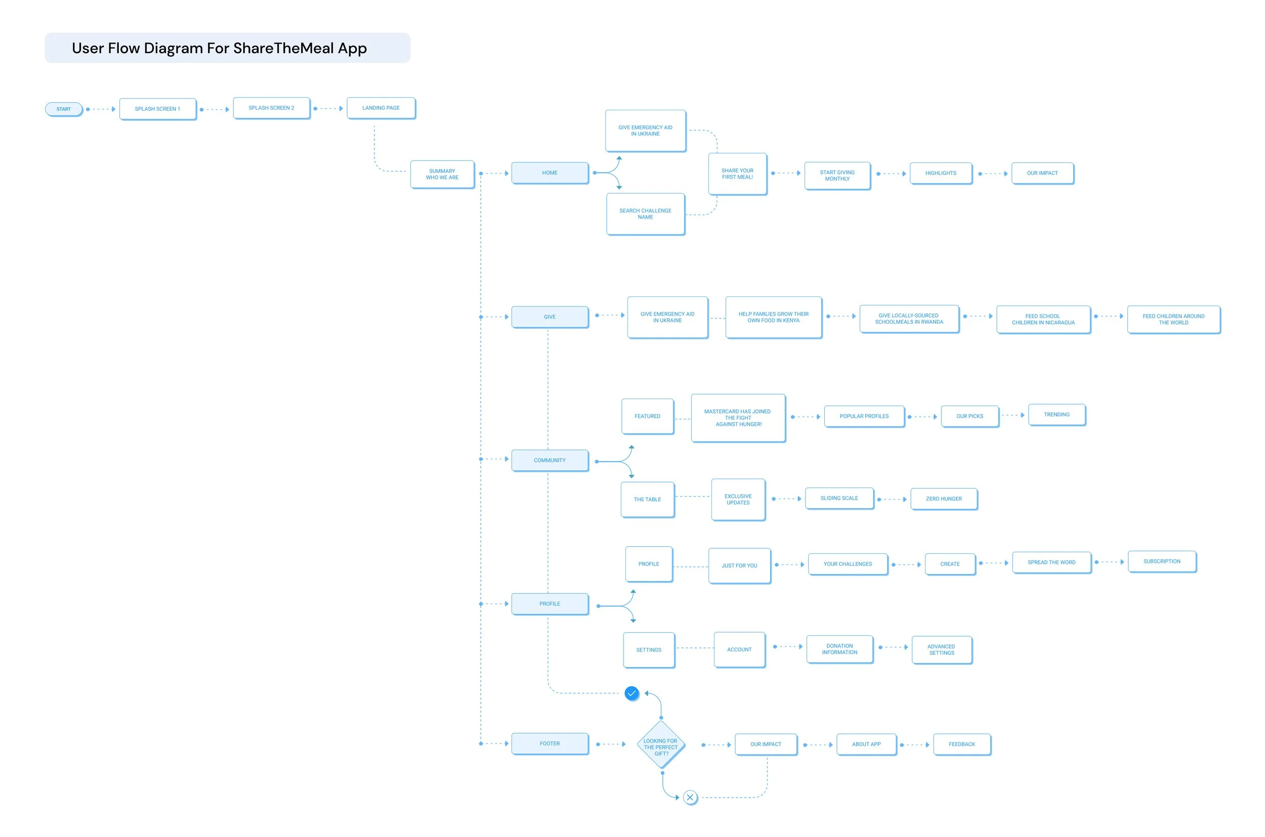
User flow
This user flow shows features such as the splash screens, onboarding, and landing page segments within the app. The landing/homepage feature allows individuals to understand the mission and donation breakdown of ShareTheMeal. Incorporating this aspect was important to give users upfront knowledge of how their donations would be used.
User testing and improvements
Low-Fidelity
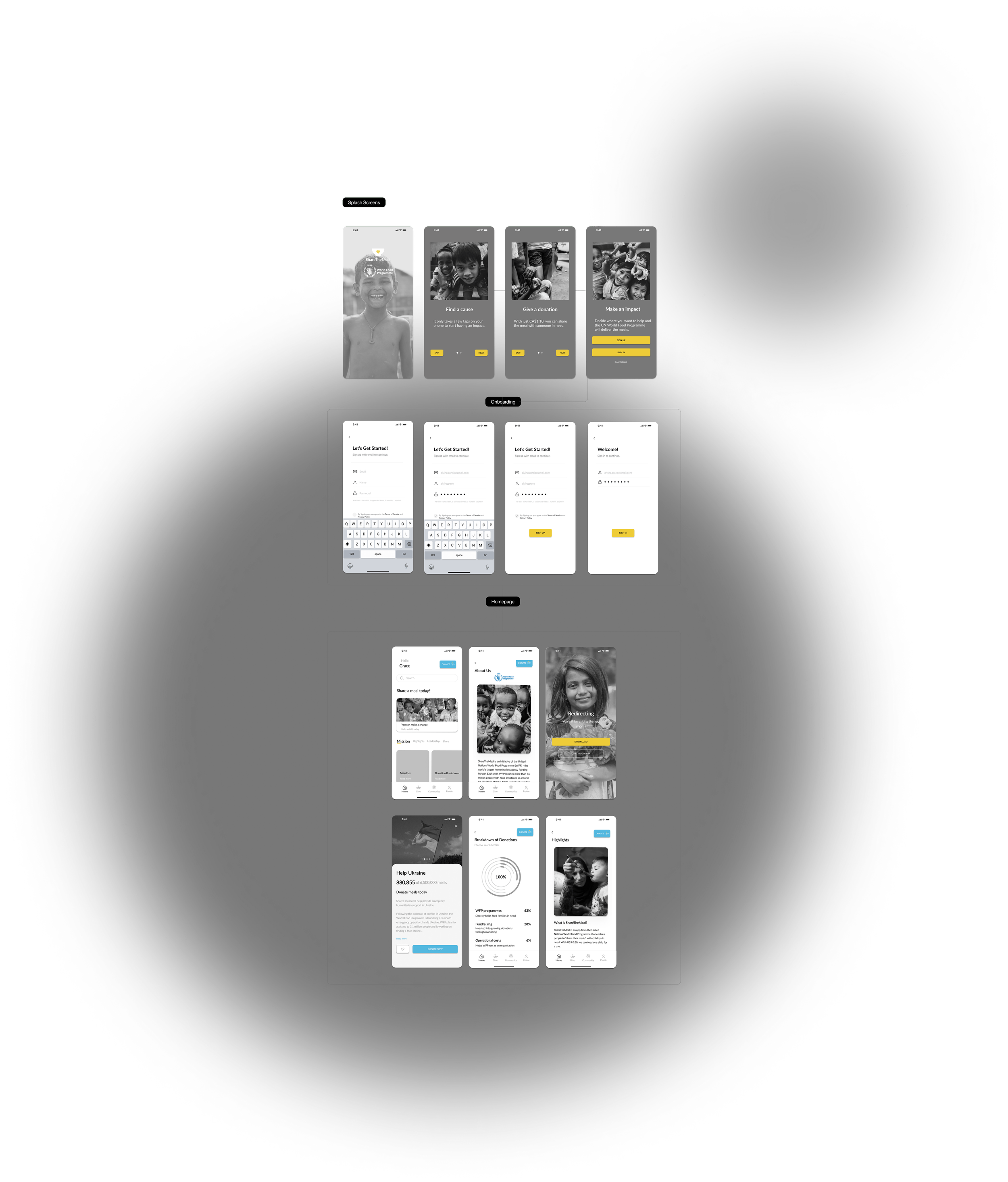
I tested how users entered the new design for ShareTheMeal. They examined the splash screens, onboarding, and donating process. In entering the homepage there will be variances in navigation, depending on the users' goal. Whether viewing the mission statement, reading the FAQs, or donation breakdown, I wanted to make sure these areas were straightforward to understand.
I focused on designing the ShareTheMeal splash screens, onboarding, and homepage. The splash screens give a concise explanation of how the app works. The home would display the mission statement, FAQs, donation breakdown, and highlights from the charity. It provided a lot of insight for the user, all in one place. Essentially it explained who the charity was. I focused on presenting quantitative data on the donation breakdown since users stated it was influential. Visualizing elements such as a graph or chart helped motivate individuals to donate.
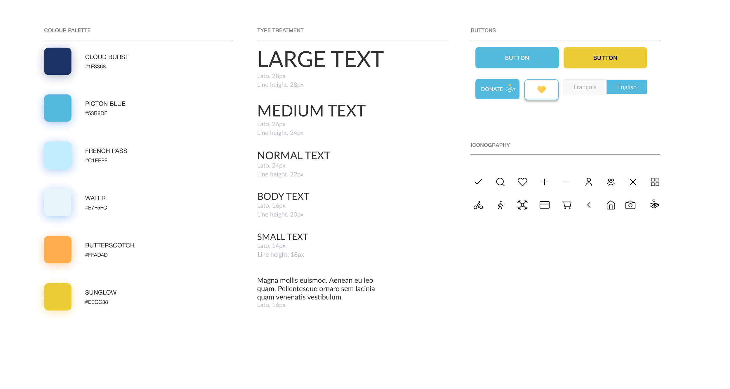
Design system
The blue color of the UN remained, which represents a peaceful environment. Maintaining this branding was important for users to recognize the corporate brand. In some instances, to create an inviting space, bright colors were incorporated into the app.
ShareTheMeal's Lato font also remains within the app, as used by the UN World Food Programme (WFP).
Final designs
Hi-fidelity
To validate responses from prototype testing, I made sure to use high-resolution images and legible text over images.


HTML, CSS, and JavaScript
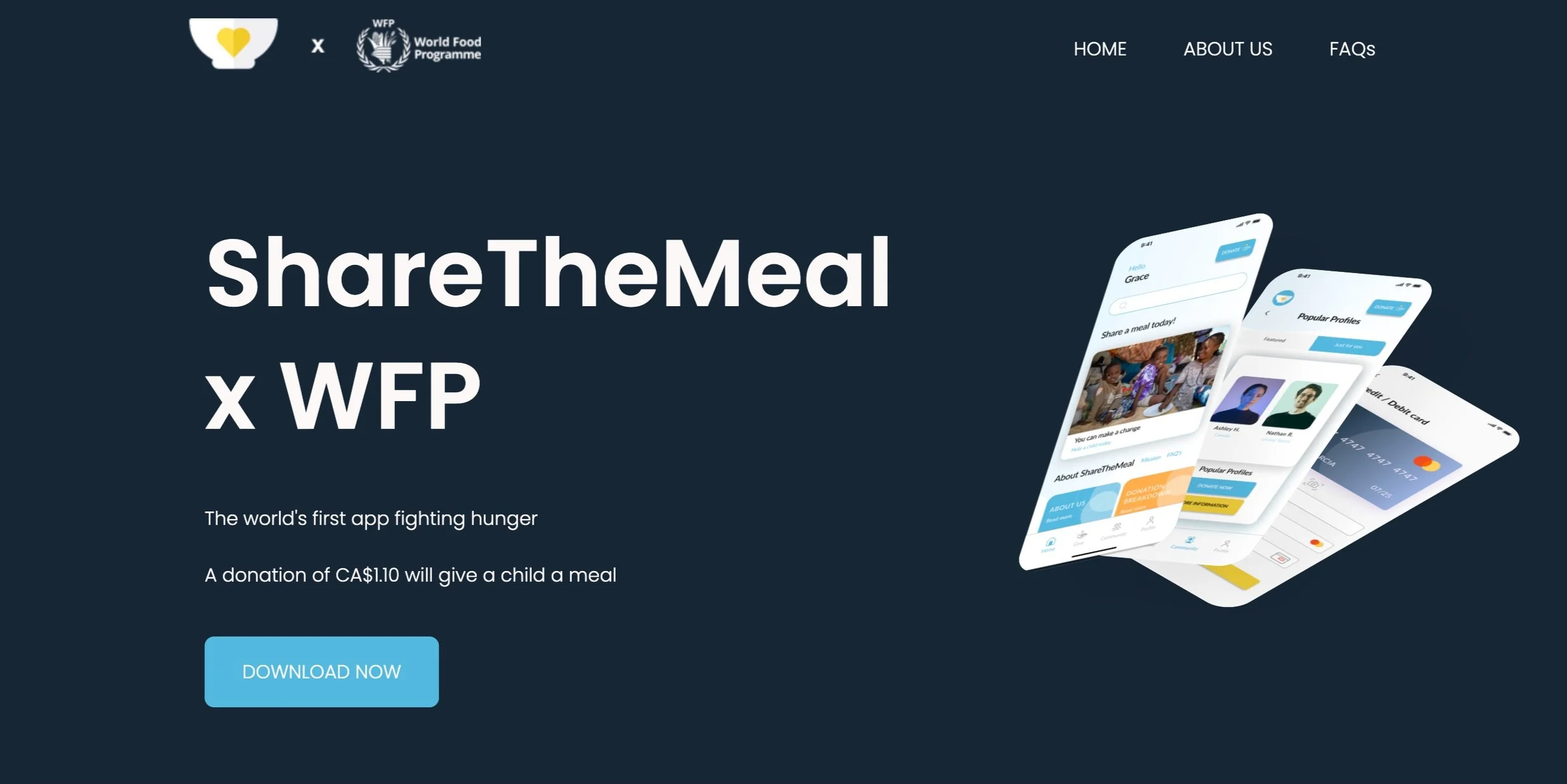
I created a landing page for the ShareTheMeal app using HTML, CSS, and JavaScript (animations). This page briefly shows who the organization is and its mission. It includes a short text and features an About and FAQ on the navigation menu. The page is concise and offers clear insight into what will happen with a donation; to provide a meal for a child.
During this process, I used Hot jar analytics to visualize how users clicked on the site: menu and CTA links. 33% of clicks were found on the Download Now button.


Conclusion
For the overall improvement of the ShareTheMeal app, the result was successful. Users can now easily download the charity app, receive an introduction to the charity, and search for further information if needed. These changes to the homepage are key in building personal connections with users. When asking for donations, users want to build trust and understanding with the recipient. The app now features introductory splash screens and a homepage with a mission statement, FAQs, and donation breakdown. These factors are useful to users who may otherwise be hesitant to donate. ShareTheMeal has redirected its app to be informative and upfront about its goals - to end world hunger. These changes will make individuals more inclined to donate and result in more donations.