Agriculture and Agri-Food (AAFC)
Government of Canada
Role
Product designer
Platform
Desktop and mobile web
Year
2021
Problem
The Government of Canada’s Department of Agriculture and Agri-Food (AAFC) has faltering navigation. It provides cumbersome information, making the user experience disorganized. The current Government of Canada: Agriculture and Agri-Food Canada (AAFC) website lacks easy navigation and readability. The typical users of this website are farmers, and agri-food investors. There is no simple way for users to easily access up to date content for programs, loans, news, and agricultural standards.
This responsive web design aims to reconfigure the homepage, menu navigation, grants, and applications for users.
Solution
This responsive web design aims to reconfigure the Agriculture homepage, menu navigation, grants, and applications for users. These areas are essential resources for farmers and producers to access. By improving the navigation, services and support will be more readily available to users.
Heuristic evaluation
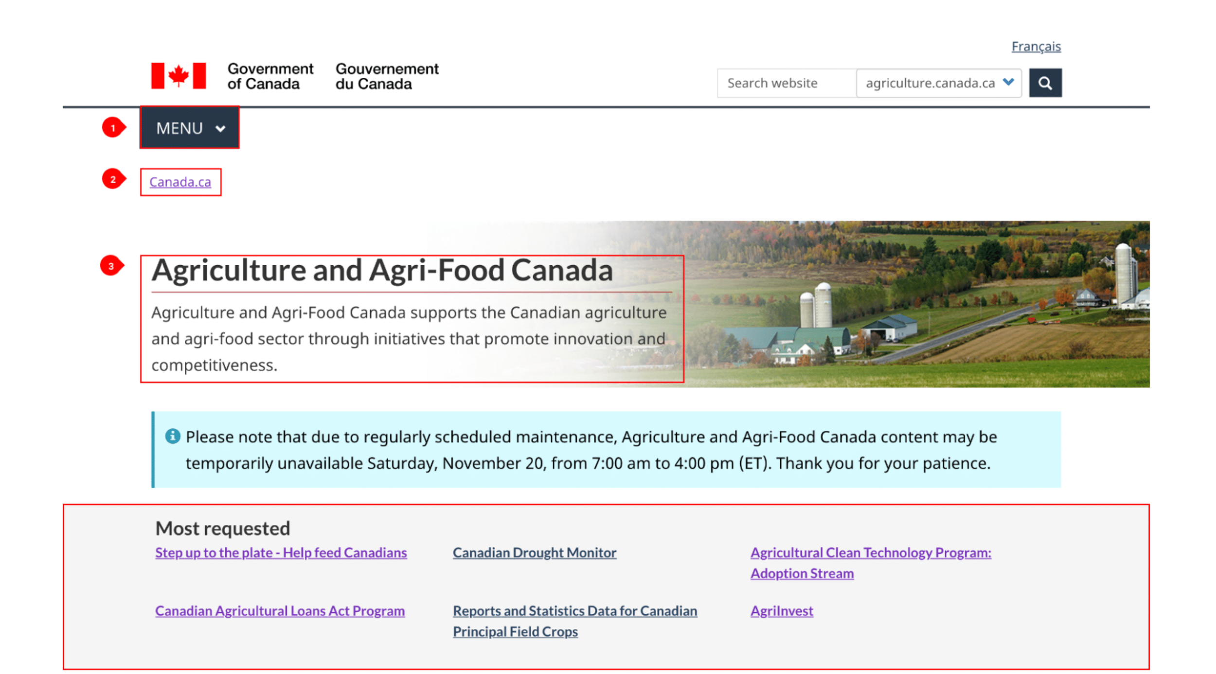
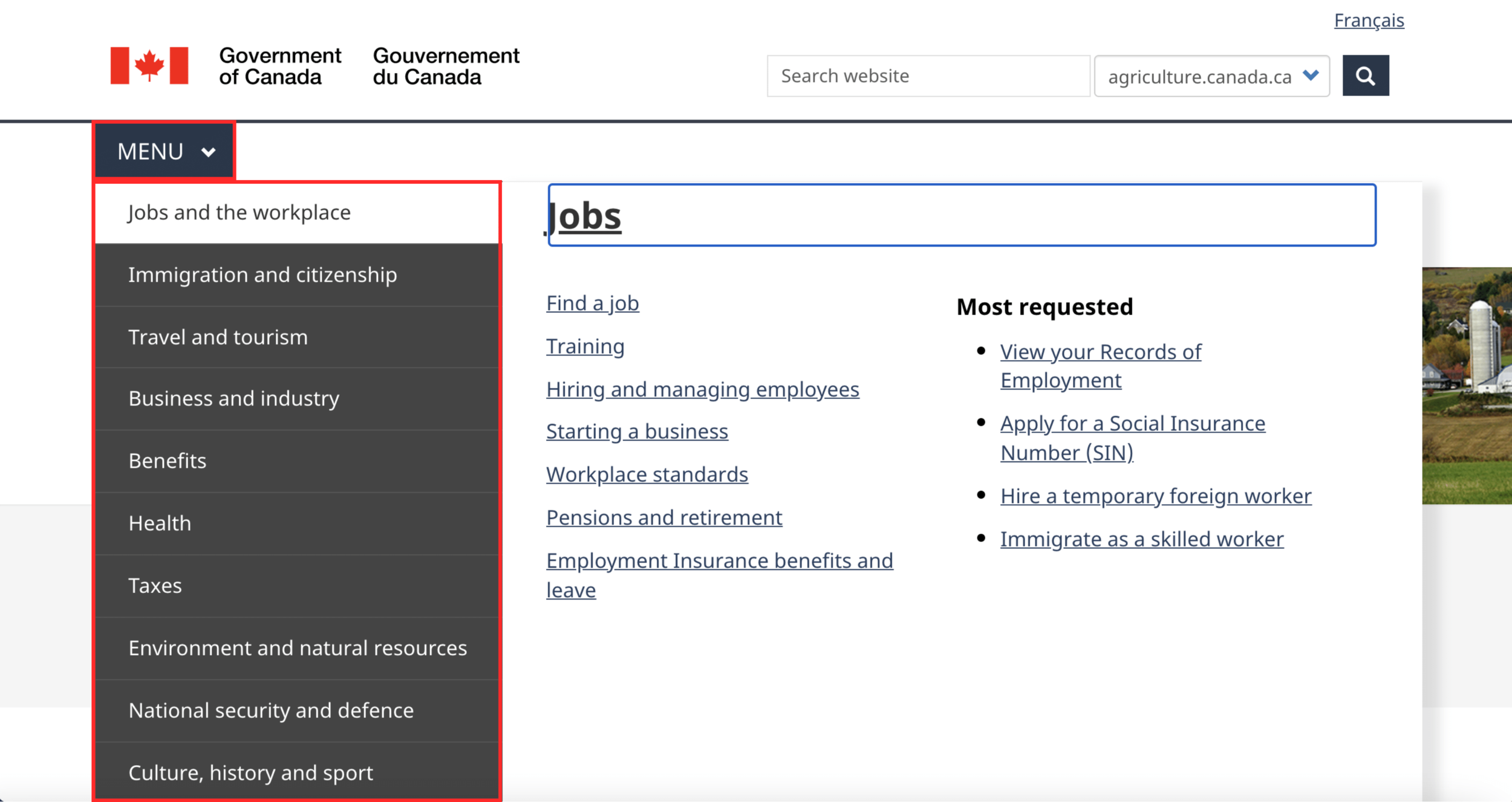
I conducted a heuristic evaluations to identify the website’s navigation and accessibility. In red frames and annotations, I highlighted the UI design patterns and usability error heuristics within the website. A major issue was that the site had no menu bar for the particular department. The menu bar navigation only controlled the entire Government of Canada site. I discovered that the current website lacked hierarchy, consistent navigation, and readability. During my usability tests, I found that many users struggled to understand the basis of the AAFC site and what it implied to do (e.g., providing loans to existing farmers).
Insights
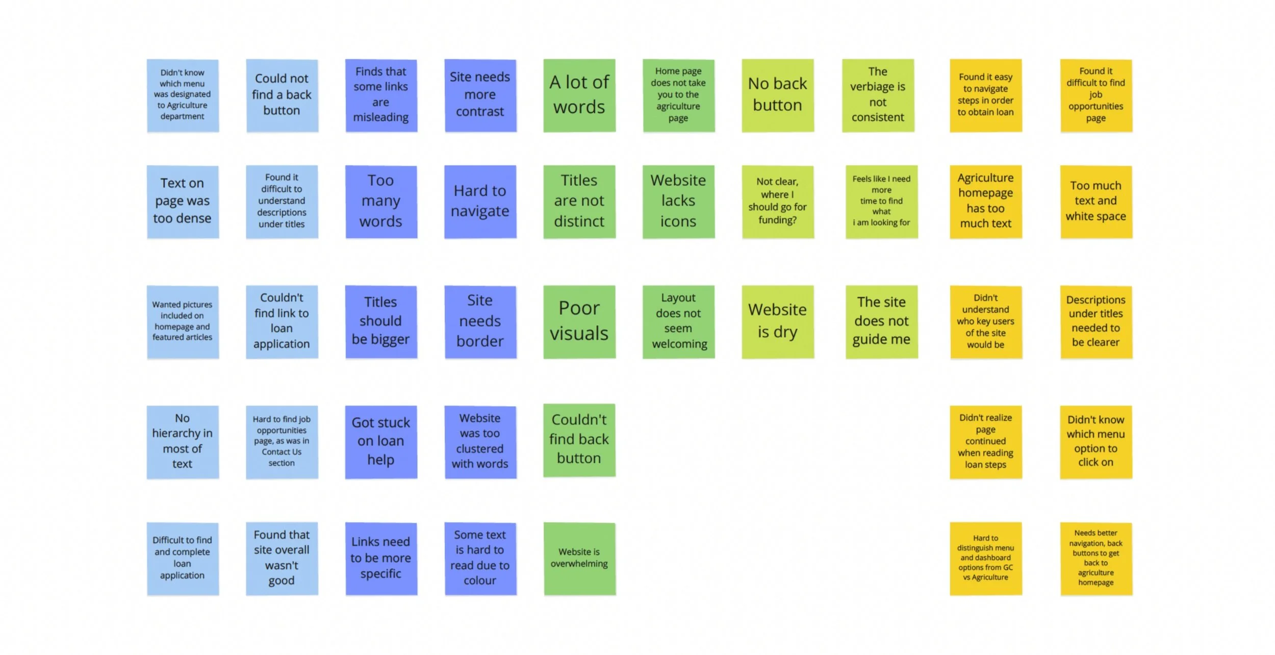
The feedback of users after usability testing aided me in my research. While using the current Government of Canada-Agriculture site, users felt frustrated. There was no hierarchy within the text, excess information, and no breadcrumbs. As a result, users felt lost within the pages, bombarded by dullness and an overload of text.
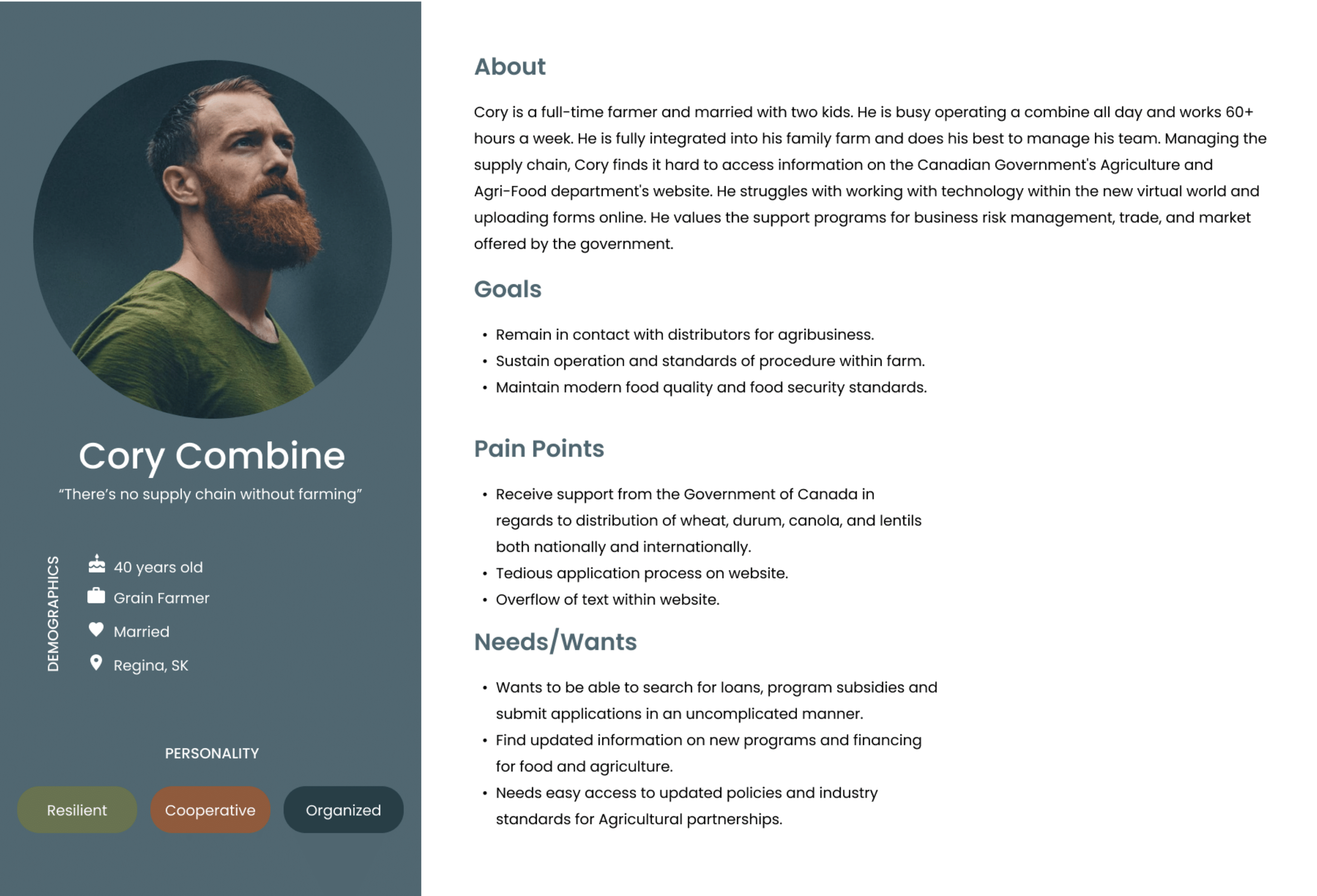
The persona
Following the initial user tests and feedback from users, I was then able to build our user persona. Cory Combine, a grain farmer from Regina, SK, is foreseen as a typical user of the Agriculture and Agri-Food Canada website. I created the objective that he would use the Agriculture services to obtain a loan for his farm.
Information architecture
With a mission to improve the site navigation, I conducted card sorting. This was necessary to hone in on the changes that were required. I began by reiterating the current navigation system through a closed card sort. I used different colors for the categories to further distinguish the changes that appear during open card sorting. Using the previous pain points in mind, I then conducted an open card sort. I kept in mind the navigation issues with the homepage, especially the lack of hierarchy and categorization.
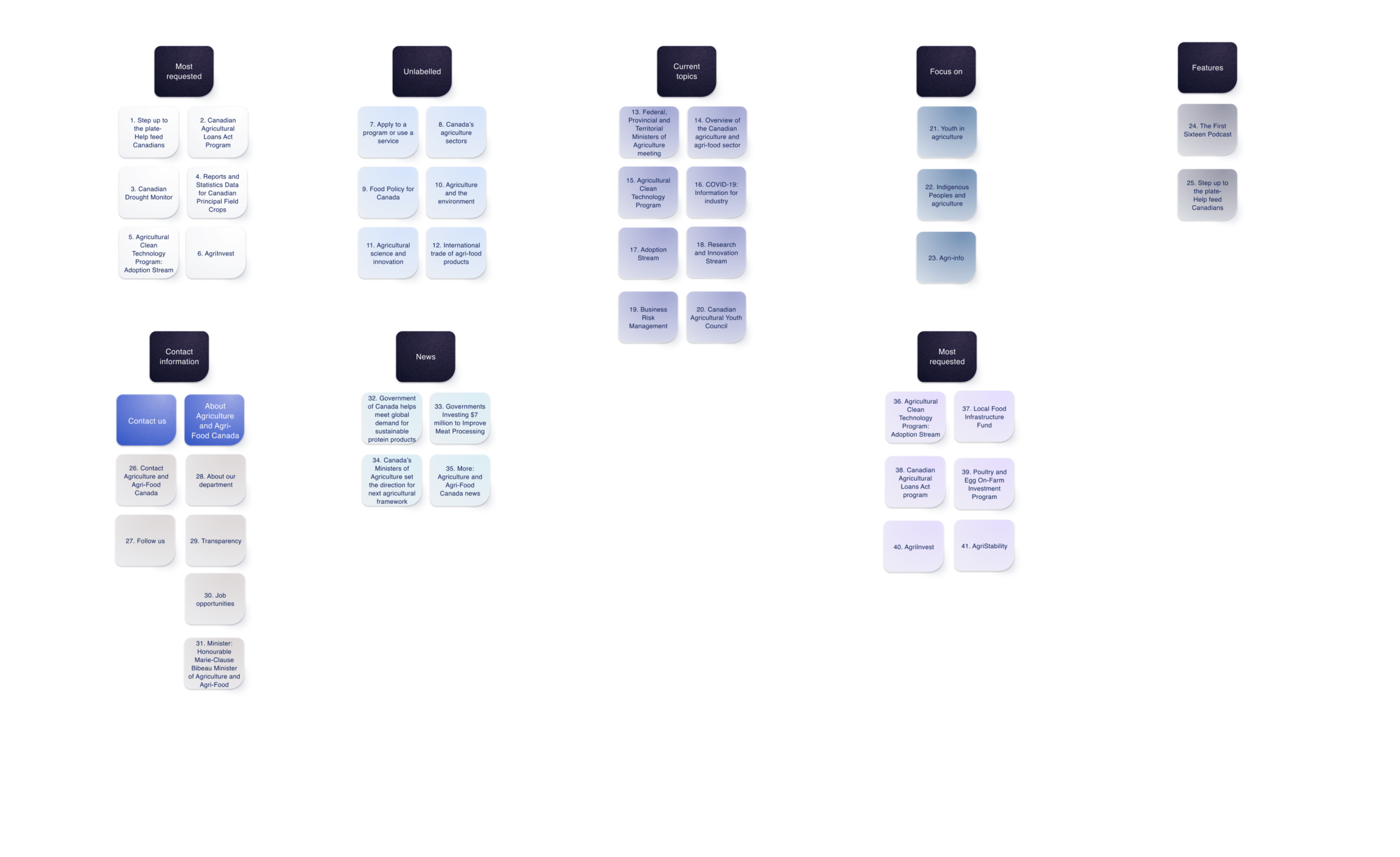
Closed card sorting
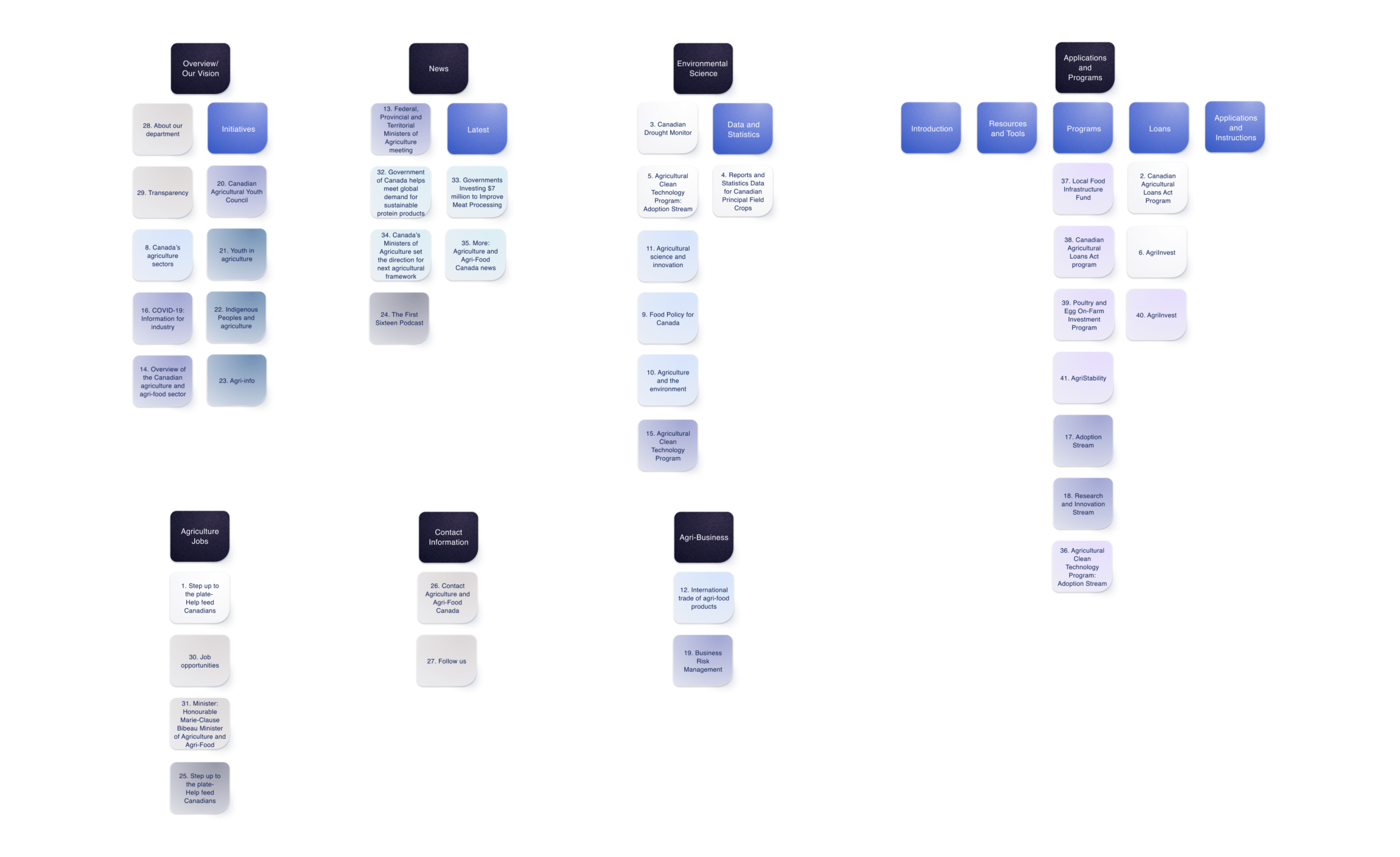
Open card sorting
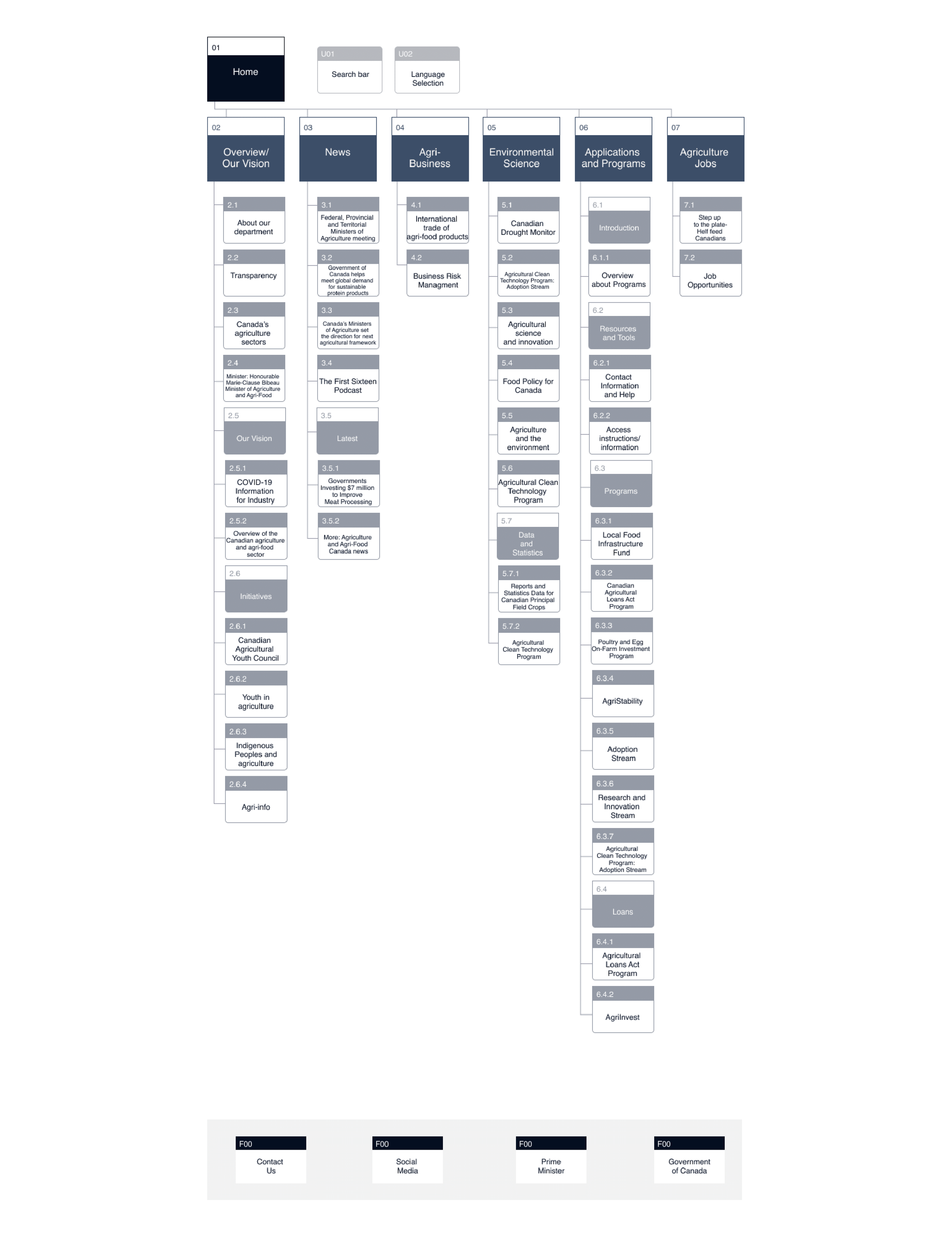
Site mapping
After I concluded the final navigation, I created a sitemap. It held the revised primary and secondary navigation of the Agriculture sector. The solution was to change the current categorization and navigation amongst Agriculture. I introduced new points of labeling to allow for a clearer understanding of what the AAFC mission is.
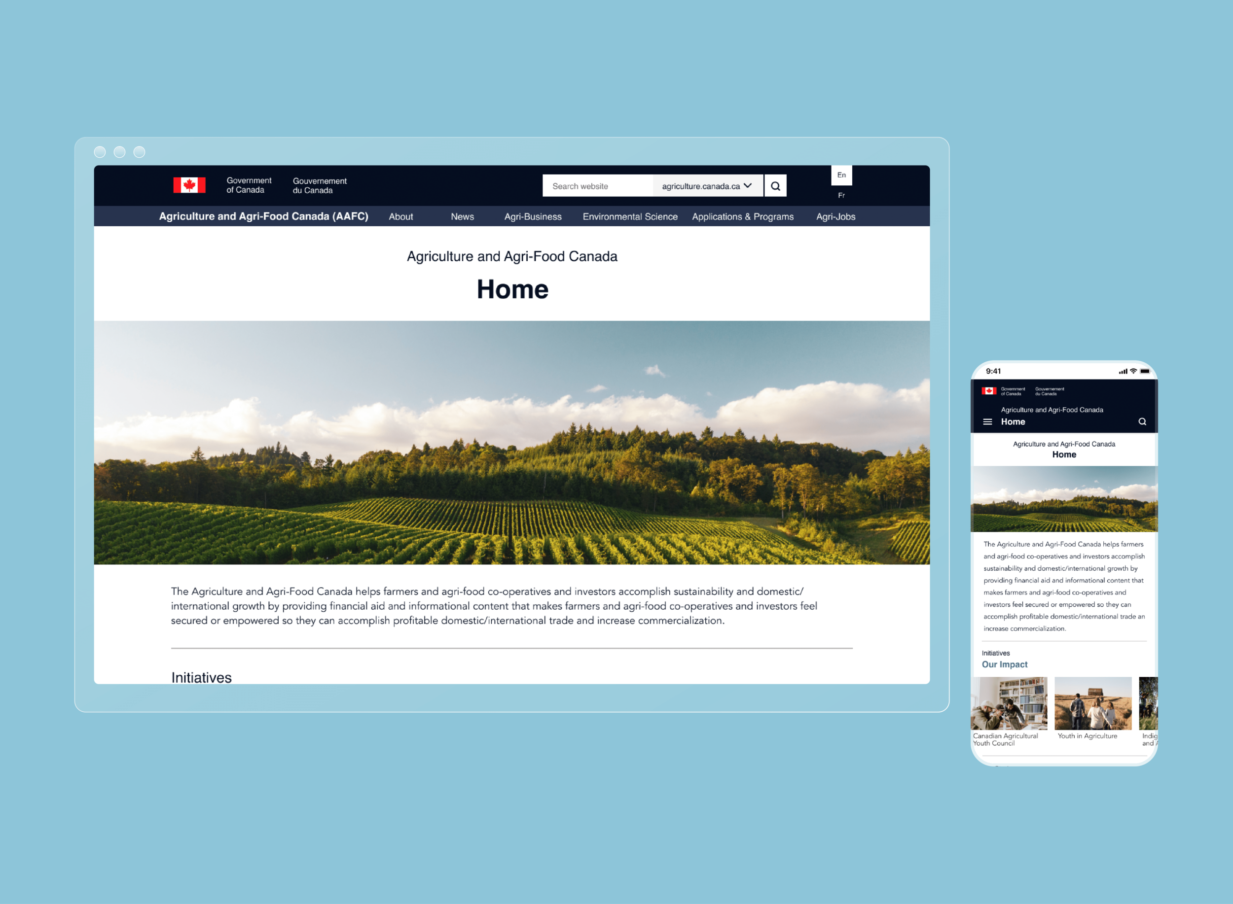
Redesigned UI
Low-fidelity
I focused on restructuring most of the original homepage. It includes the primary and secondary navigation at the top of the page. The menu navigation structures around the most prominent systems used by the Agriculture field. The navigation bar contains AAFC labeling (breadcrumbs) to help users track their pages. Any secondary navigation is categorized alphabetically to help analyze the information.

Homepage
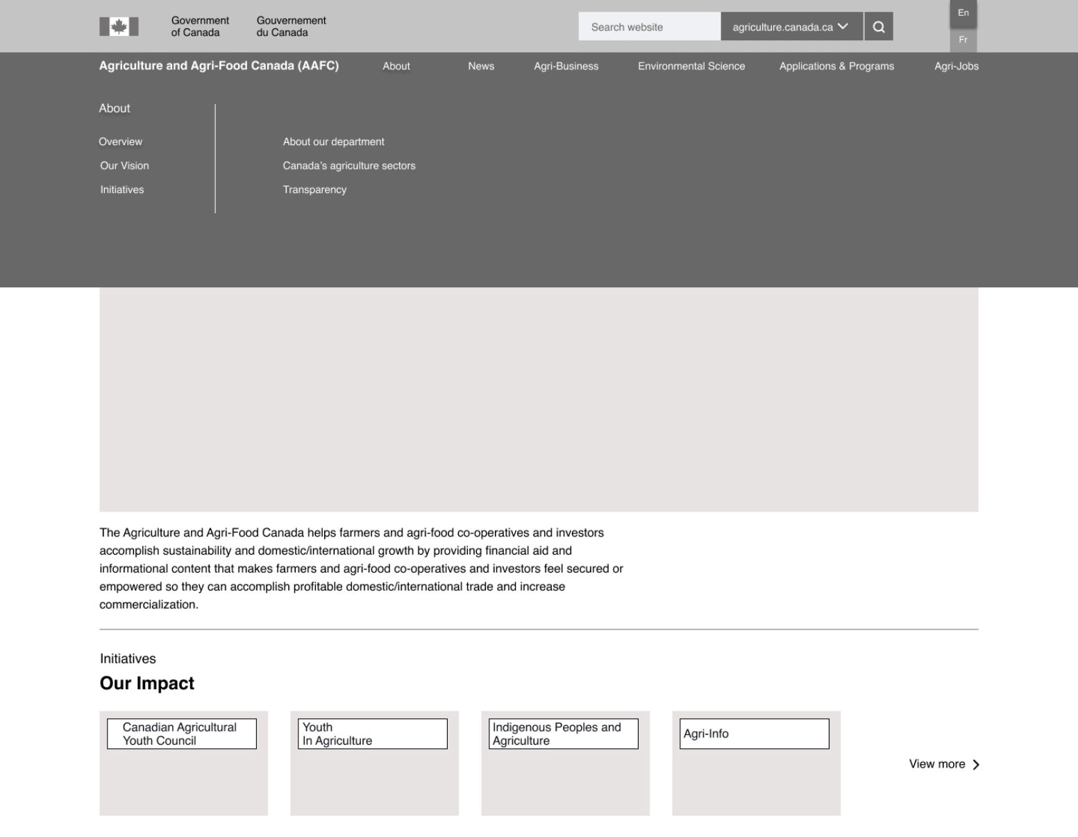
Navigation bar
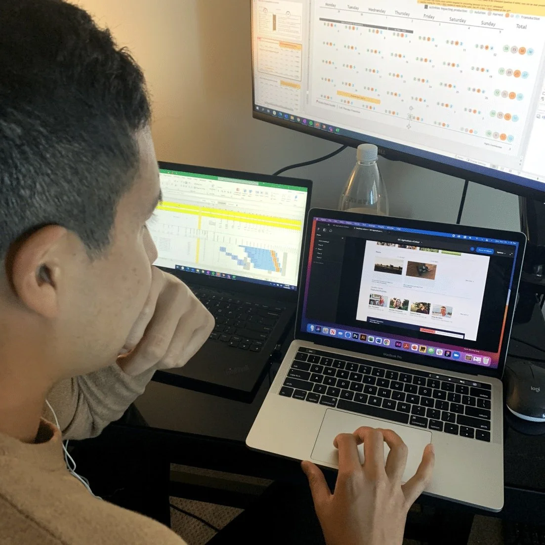
User testing
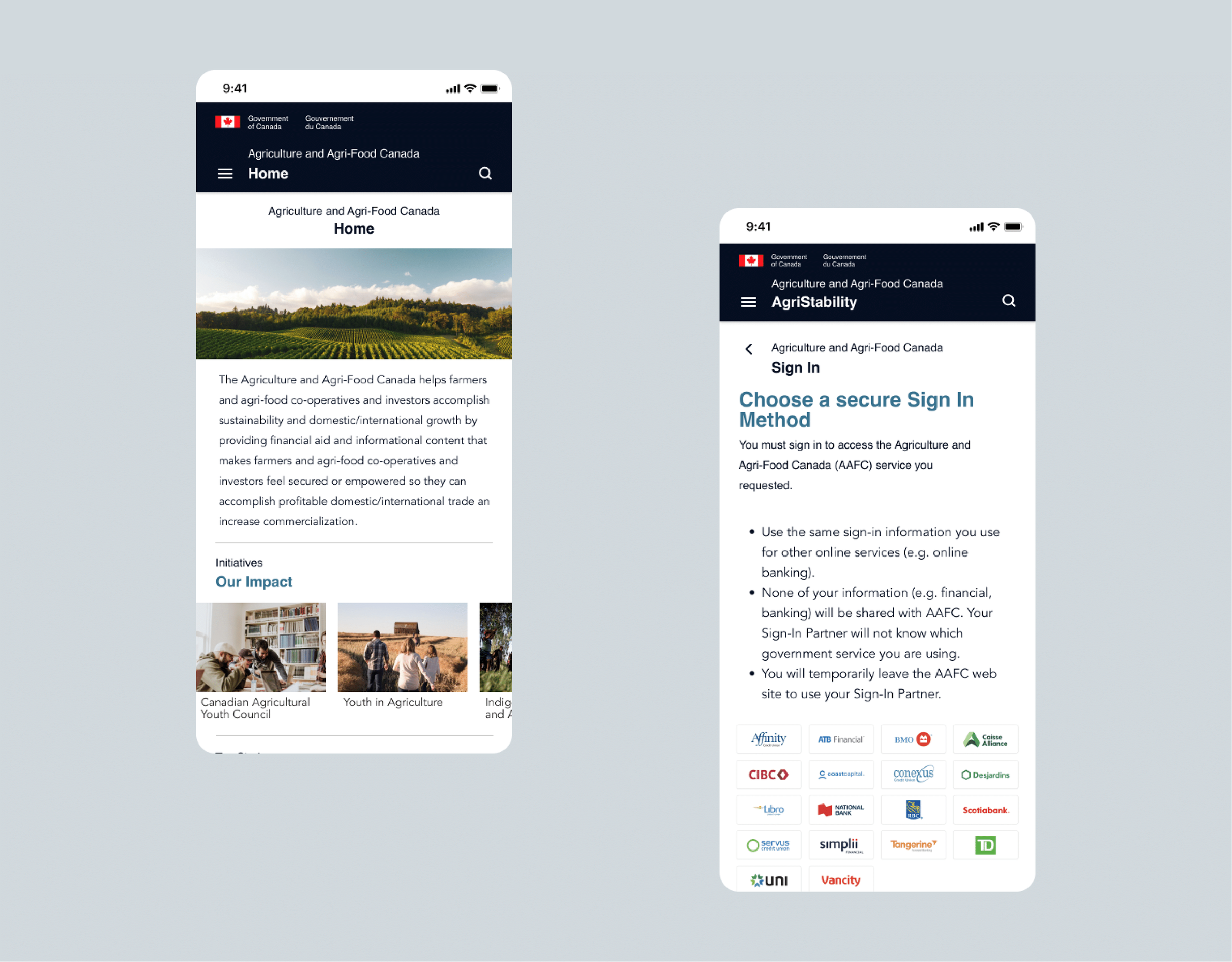
Desktop and mobile
Desktop

Mobile
Mobile footer

Mobile cards and buttons
I conducted five usability tests, which had overlapping feedback regarding the UI. The font sizes were legible, although the buttons and navigation bar were not working on both devices. There were definite prototyping issues. In addition, the font sizing was too small for the mobile device. Users were unable to target the buttons with their fingertips. Revising this was crucial since clicking on a button should be a simple tactic. I considered this and tested the sizing at 44px. This accuracy allowed for a later, successful response.

Design system


Final designs
Desktop


Mobile

AgriStability
One of the original issues within the Agriculture website was the poor navigation and mislabelling. The programs and services offered were hidden within the homepage. I added breadcrumbs and separate pages for these issues.
Steps to apply
I broke down the steps to apply for a program like AgriStability. It would clearly instruct users. The previous application was overwhelming with text and no clear language.

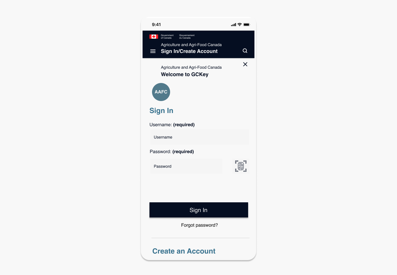
Sign in
The breadcrumbs and hierarchal labeling clearly instruct the steps to apply for a grant and/or program. In this case, specifically for the Agriculture and Agri-Food Canada sector.

Conclusion
After much testing, the Agriculture site went through many iterations. I constantly made sure that UI elements and the RWD principles were correct. An important factor was resolving the issue of menu bar navigation. The redesign addressed that issue for the agriculture sector. The usability tests were vital to gain more perspective. The feedback allowed me to see design flaws and a lack of written/verbal communication. Users primarily used the new top navigation and rarely scrolled to the bottom of a page, as they had in the previous website. That instantaneity thought process stuck with me along the way and will be going forward in design.