National Health Charity
Diabetes Canada

Role
Product designer
Platform
Desktop and mobile web
Year
2022
Problem
Diabetes Canada is a charitable website that provides information and research for those living with diabetes and pre-diabetes. Their current website contains no sitemap structure, which leads to poor navigation.
The focus was to redesign the most critical elements that faltered users. During testing, only 40% could navigate through the site. Areas of concern involved recognizable menu navigation and CTA links (i.e., resources, forms). Diabetes Canada's website contained no sitemap structure. In addition, the left-hand side menu bar navigation made it difficult for users to access information and CTA links. Users needed a uniform website with responsive UI elements.
The redesigned pages honed in on resources and support for those struggling with diabetes. The pages included the Homepage, CANrisk test (diabetes risk), Get involved, and Stories pages.
Solution
It was important to consider the pages that would be most accessible to users unfamiliar with diabetes. These pages would hone in on resources and support for those struggling with diabetes. The pages included the Homepage, CANrisk test (diabetes risk), Get involved, and Stories pages.
Quantitative research
20 individuals participated in a survey to see if diabetes directly impacted their lives. The result found that many participants had family members affected by the disease. However, many were unaware of Diabetes Canada and the information it provided. Given the knowledge of the website, in the future, those said that they would use it as a resource.

Insights
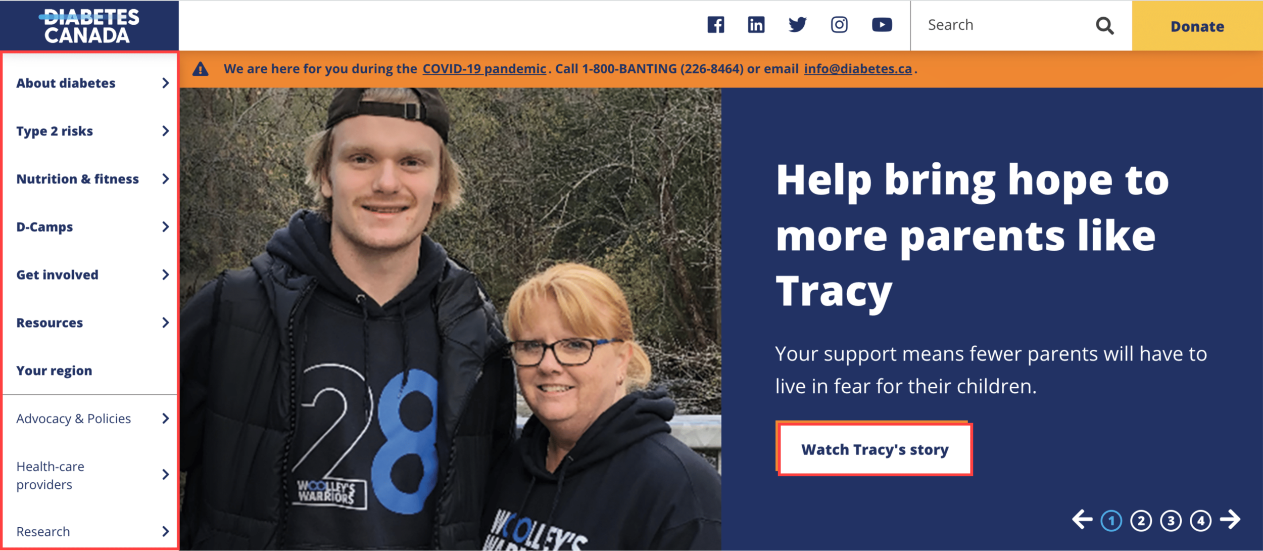
5 users tested the flow of the current Diabetes Canada website. Users found the current website homepage to be overwhelming. There was too much information, with a lack of categorization or hierarchy. Given the objective, "Find the stories page", only 60% successfully found it. The stories link was on the landing screen hero image, but many neglected it. Users sought to use the left sidebar menu navigation instead. Therefore there was a disconnect between where to find information. The menu bar was the most desired option to lead in navigation, which the current site failed to make better use.
The persona
Initially, before research tests and interviews, the hypothesis was that the typical users of the organization's website would be senior citizens. In particular, those with a spouse diagnosed with diabetes. However, after further research, users did not identify as that. Users were Millennials with loved ones; parents, aunts, uncles, grandparents living with the disease. This study helped establish a user persona that would be the most identifiable user to Diabetes Canada's website.
Researcher Reed is a 35-year old who has a father diagnosed with Type 2 diabetes. Type 2 is hereditary, which makes him wonder what his risks are, therefore visiting diabetes.ca.

Information architecture
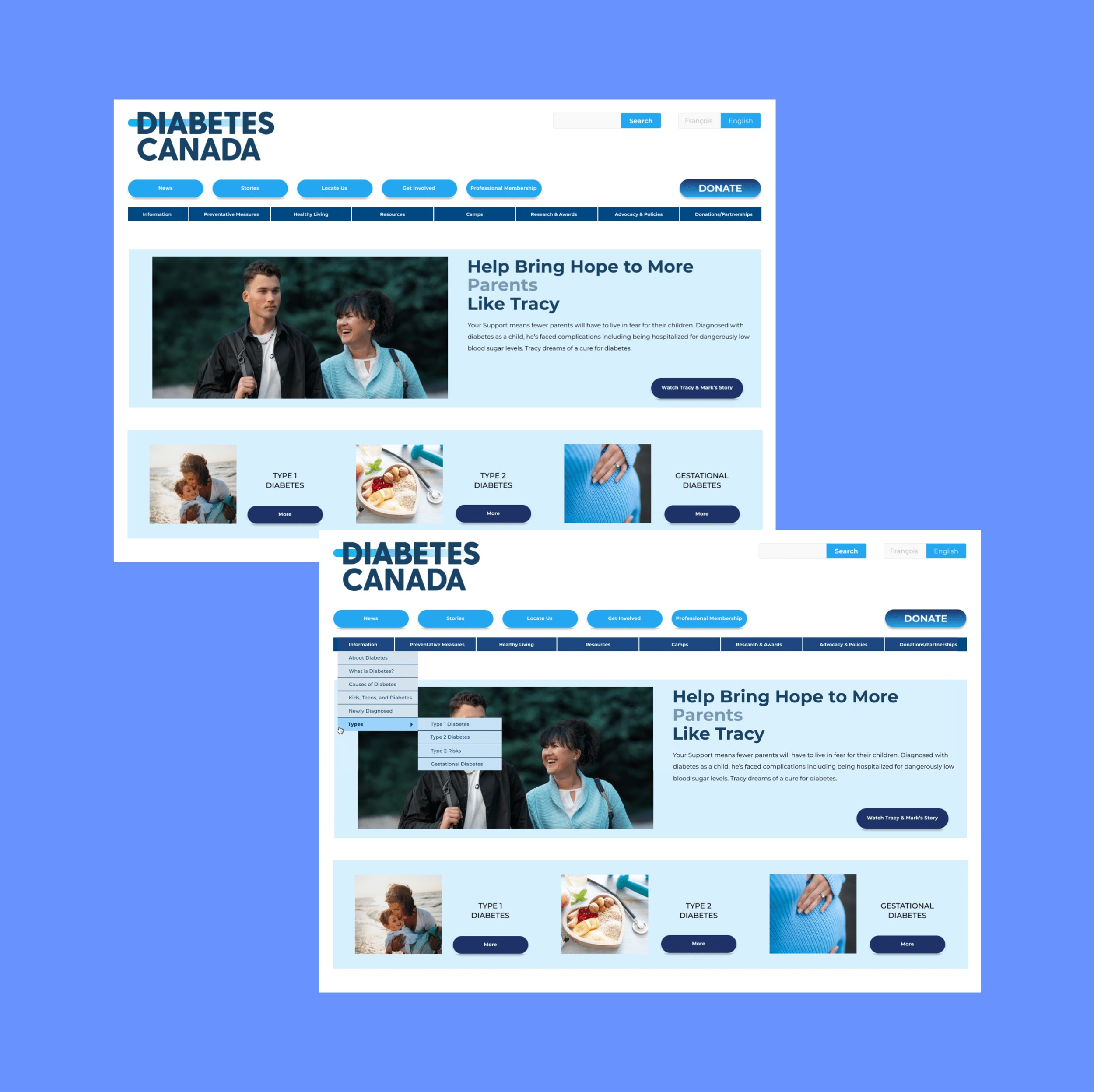
To have a clearer image of the problem to be solved, I conducted a closed card sort. The aim was to resolve the current lefthand menu bar navigation issue. Since it confused many users during previous tests, this was an opportunity to understand what people wanted from the site. Users could sort through pre-determined categories from the current menu navigation.
Unlike the typical top menu navigation on a website, the left version took up a large portion of the homepage area. After labeling the current categories, primary, secondary, and tertiary- the closed card sort began. The main takeaway from the activity found that users wanted fewer tertiary categories and immediate links from the menu.

Closed card sorting

Open card sorting
Site mapping

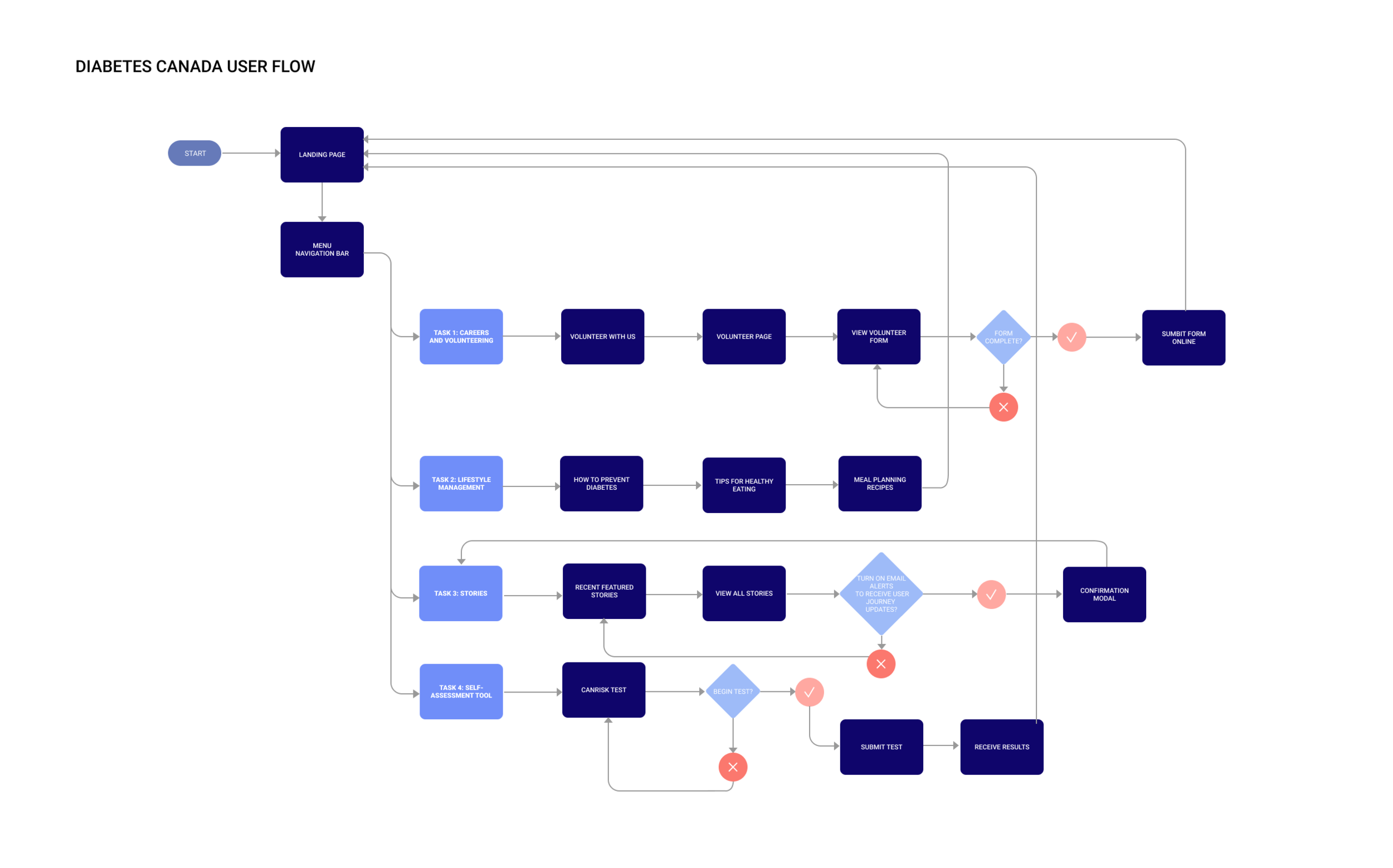
User flow
The sitemap and user flow were made with the intent of a path that the user, Reed would use. Particularly, every objective concerned "Researcher Reed" and his use within the website. The revised structure of the sitemap would allow content accessibility, something the previous site lacked. The redesign included more suitable menu bar navigation, category labeling, and homepage accessibility.
More specifically, the focus shifted to making resources accessible from the landing page. The original site navigation was not intuitive for users. A new user like, Reed to the site wanted information clear to him. A clear path would direct him to find research and resources for his father's health condition. The effort to transform the homepage included providing instant access and CTA links to the CANrisk test (diabetes risk), Get Involved, and Stories pages.
Homepage menu bar
Low to hi-fidelity

Stories
Low to hi-fidelity
A lot of focus went towards transforming the original homepage. The provided information was concise and focused on the most vital aspects of healthy living. The redesign included a top navigation bar with CTA buttons. In addition, a master menu navigation bar was below it. The horizontal navigation would foremost improve the previous left-hand side menu configuration.
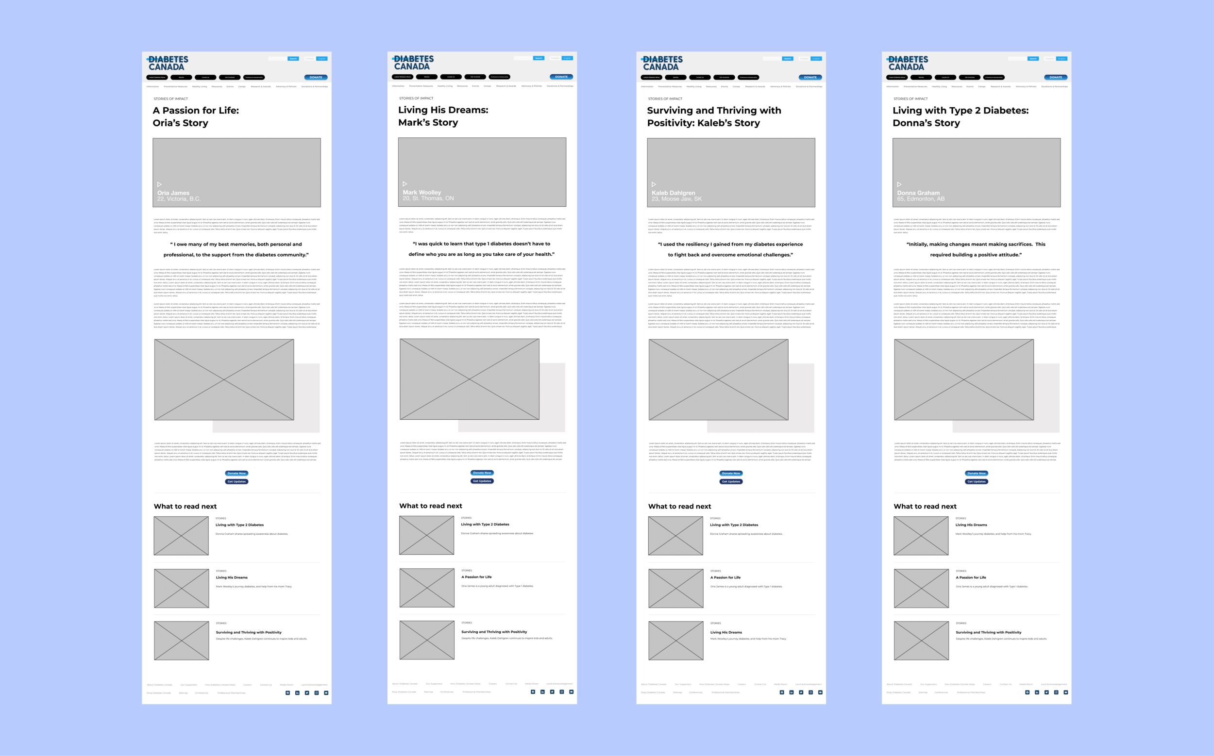
To improve accessibility to resources, I focused on redesigning the Stories pages. It provides a powerful area for those to find support and wisdom alongside their diabetes journey. The stories pages feature enlightening articles about individuals living with diabetes. Although hidden on the original site was now an attainable, easy-to-read, place of hope.
User testing
Desktop and mobile
After designing the low-fidelity wireframes, 6 individuals tested the new designs. The feedback from the users provided valid points to improve the design. The sizing of buttons, particularly on the mobile device, needed resizing. The width of the current buttons was not sufficient in length, resulting in fewer clicks. In addition, many of the desktop pages required modifications to their prototyping. It was crucial to correct the site navigation since it was a prominent factor in the initial research.

Design system
Color palette
The original color system for Diabetes Canada remained. It was important to keep the blue color palette as it is the global color to unite diabetes. Maintaining a symbol like blue would sustain awareness of the disease. The aim was to be as consistent and precise as possible within the entire design system.

Components

Stories
Desktop

Stories
Mobile

Final designs
Desktop
Mobile


Conclusion
The redesign of the Diabetes Canada website was overall successful. The users were always the main driver of the website, especially Researcher Reed. The display of content on the homepage was created to be simple and easily understood. Those visiting the website will not always be health professionals, so the information provided should be comprehendible. Therefore, why the Homepage, CANrisk test, Get involved, and Stories pages were so important. In essence, users like Mark could continue to identify with the non-profit organization and its mission to aid people's journeys.
The redesigned top menu and secondary and tertiary navigation play a prominent role in the RWD. Users are now able to access diabetes news, stories, and resources. UI elements are essential to aid an individual experience throughout a site like Diabetes Canada.